PeakLab v2 Documentation Contents R2N Software Home R2N Software Support
GLM Significance
The Significance button in the GLM Review opens a plot of the overall significance of predictors in the model set. This is a comprehensive visualization of the whole of the fitting, and includes the full permutation GLM models, and if fitted, the smart stepwise models, and the sparse PLS models.
Significance Plot in Review
The significance plot in the lower graph of the GLM Review shows a signed significance for the current count of predictors in the presently selected model. The reference in this 2D plot is a sum of the signed t-values at each predictor (x-value or wavelength) across all retained models having the predictor count of the currently selected model. This sum is normalized to the total count of predictors across those same retained models.
In the Review's lower plot, you can use the Display the Average Significance Map for all Counts of Predictors right click menu option in the main graph to plot the significance for all of the model counts currently included in the model list. This specific format may be useful, but the visualization will be limited when there are many different predictor counts. This Significance option will be more useful for overall global comparisons.
Global Significance
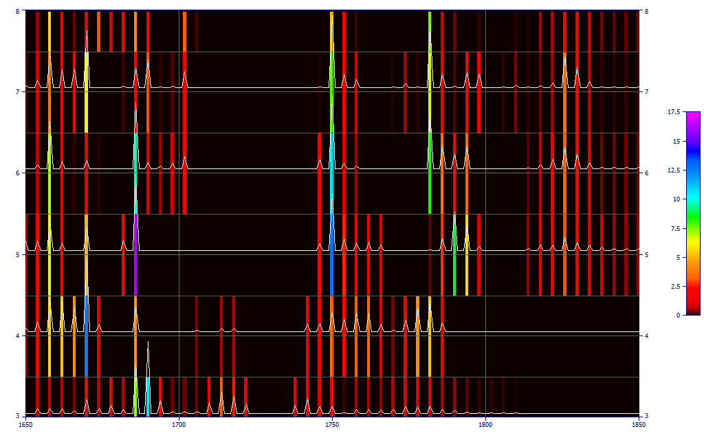
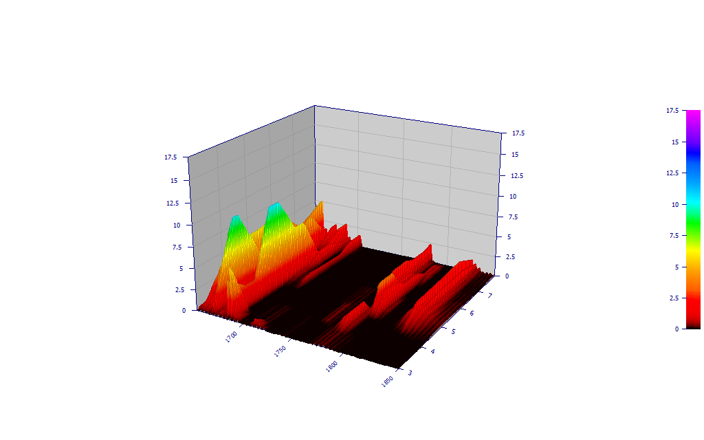
The purpose of this option is to visualize, in a 3D surface plot or a 2D contour plot, the significance observed in the whole of the modeling.

This global significance plot is unsigned, meaning that |t| is used in the sums of the significance values. Because the absolute value is used, this visualization does not give you a picture of whether or not a predictor adds to or subtracts from the prediction estimate, only which of the x-predictors or wavelengths are important. In this example. we see a number of strong wavelengths and also wavelengths where no retained models exist. The strongest significance is seen at two of the 6-predictor wavelengths. As you will note it is quite easy to spot the wavelengths of primary importance.
This significance surface is a picture of the specific fitting occurring within the full permutation modeling. There will be significant differences in this plot with x-spacing, and if the refinement to 1 x-increment is implemented. In general, however, given the line width spreading in the spectra, the plots should be similar.
Format
You can choose Contour, 3D Gradient, or 3D Shaded plots. The Force Zmin=0 will set the lower value of the plot to 0 if needed. The 3D Gradient plot does give a easier to grasp overall picture, but it will be harder to see the individual wavelengths, even when using the 3D Animation.
Optimal Determination of Significant Predictors
In order to see the most complete picture possible of the significant predictors, you may want to use this Significance option when your prediction band is narrow enough, or the x-spacing large enough, that you can fit all permutations in a reasonable time without filtering any of the wavelengths. That will render this kind of comparison plot more complete since filters selectively remove certain non-productive x-predictors or wavelengths as the predictor count increases.
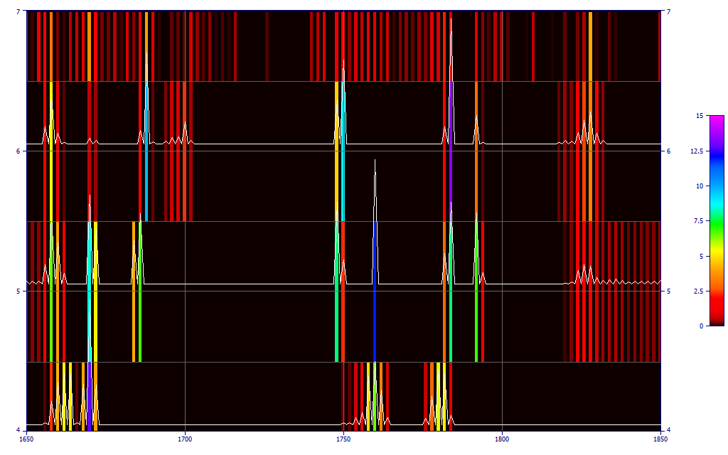
The above significant plot is a highly accurate 2 nm fit, no filters, full permutation (from the Modeling FTNIR Spectra white paper) where the 5 and 6 predictor models are zoomed in. Over 1.35 billion fits were made in about ten minutes just to get full coverage of the 1 through 6 predictor models at this x-sampling density.
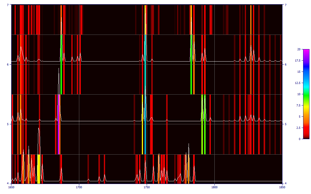
This is from a 4 nm x-spacing full permutation unfiltered fit using 1 nm post-refinement. This fit, also through 6-predictors, processed 20 million equations and required just 10 seconds. If you look closely at the 5 and 6 predictor fits, you will see roughly similar significance profiles. This higher x-spacing with 1 x-increment refinement is a good approach for assessing all predictors.